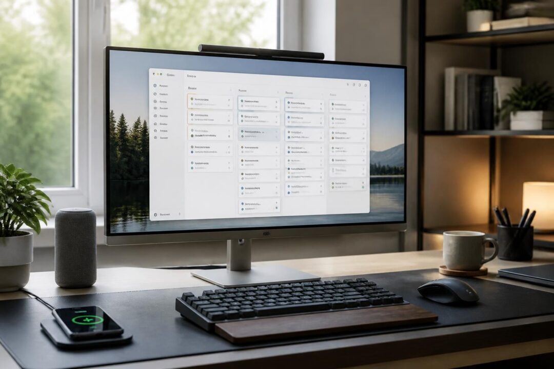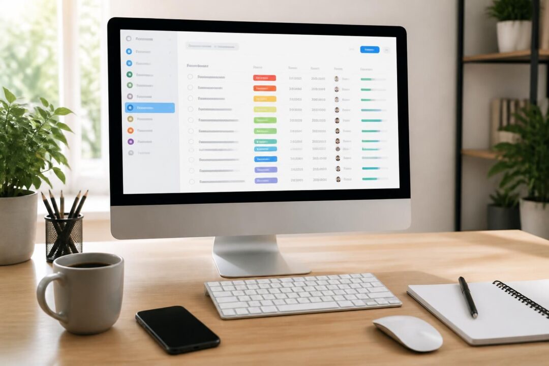
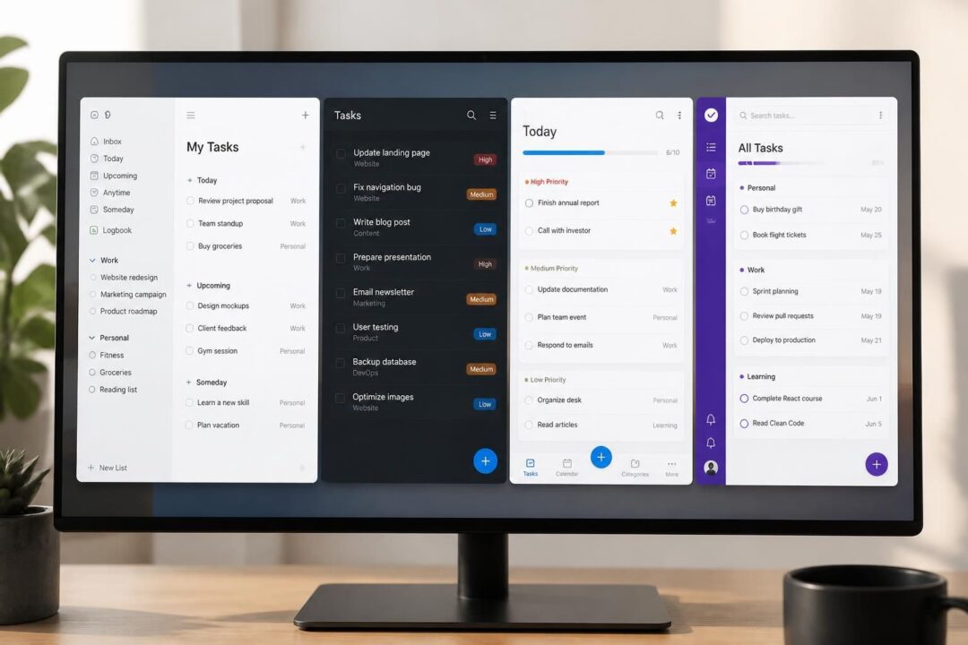
In a desktop to-do list, the interface is never “just design.” It is the control panel for attention, priorities, and follow-through. Screenshots reveal this instantly. A single captured window can show whether a tool expects quick capture or careful planning, whether it favors a solo brain or a team workflow, and whether it treats tasks as flat lines or as living parts of a bigger system. Moreover, desktop software still sets the pace for many knowledge workers because it supports keyboard speed, multi-window focus, and long-form context that mobile screens hide.
In practice, the most telling screenshots are not the marketing hero images. Instead, the everyday views matter: the inbox after a busy morning, the project list after a re-org, or the calendar panel during deadline week. Those screens expose usability choices like contrast, density, click depth, and the “cost” of adding details. Consequently, comparing interfaces side by side helps you predict whether task management will feel calming or brittle. To make those differences concrete, the sections below read common desktop layouts like evidence and connect them to real work patterns, including a running example of a midsize operations team trying to reduce missed handoffs.
- Desktop screenshots often reveal the real interaction model: capture-first, plan-first, or collaborate-first.
- Interface density influences usability, especially when task lists reach 200+ items.
- Hierarchy (subtasks, nesting, checklists) changes how complex work gets broken down and tracked.
- Cross-platform coverage matters, yet the desktop user experience still anchors daily planning for many roles.
- Free tiers vary widely; therefore, “usable without paying” is a more helpful test than “has a trial.”
- Independent reviews on sites like G2 and Capterra help validate a comparison beyond one perspective.
Desktop To-Do List Interfaces: How Screenshots Expose the Interaction Model
A screenshot answers a question that feature lists often dodge: what does the software want you to do first? Some desktop to-do list interfaces put an inbox front and center, while others lead with projects, boards, or calendars. That first screen shapes behavior. Therefore, it also shapes outcomes like missed deadlines or clean handoffs.
Consider a fictional operations group, “Northline Services,” with eight staff members. They juggle client onboarding, billing follow-ups, and internal audits. When Northline tests new task management software, the first week produces messy screenshots: half-filled inboxes, duplicated items, and vague titles like “Call client.” Those imperfect screens become the best diagnostic tool, because they show friction points in real use.
Capture-first interfaces: the inbox tells the truth
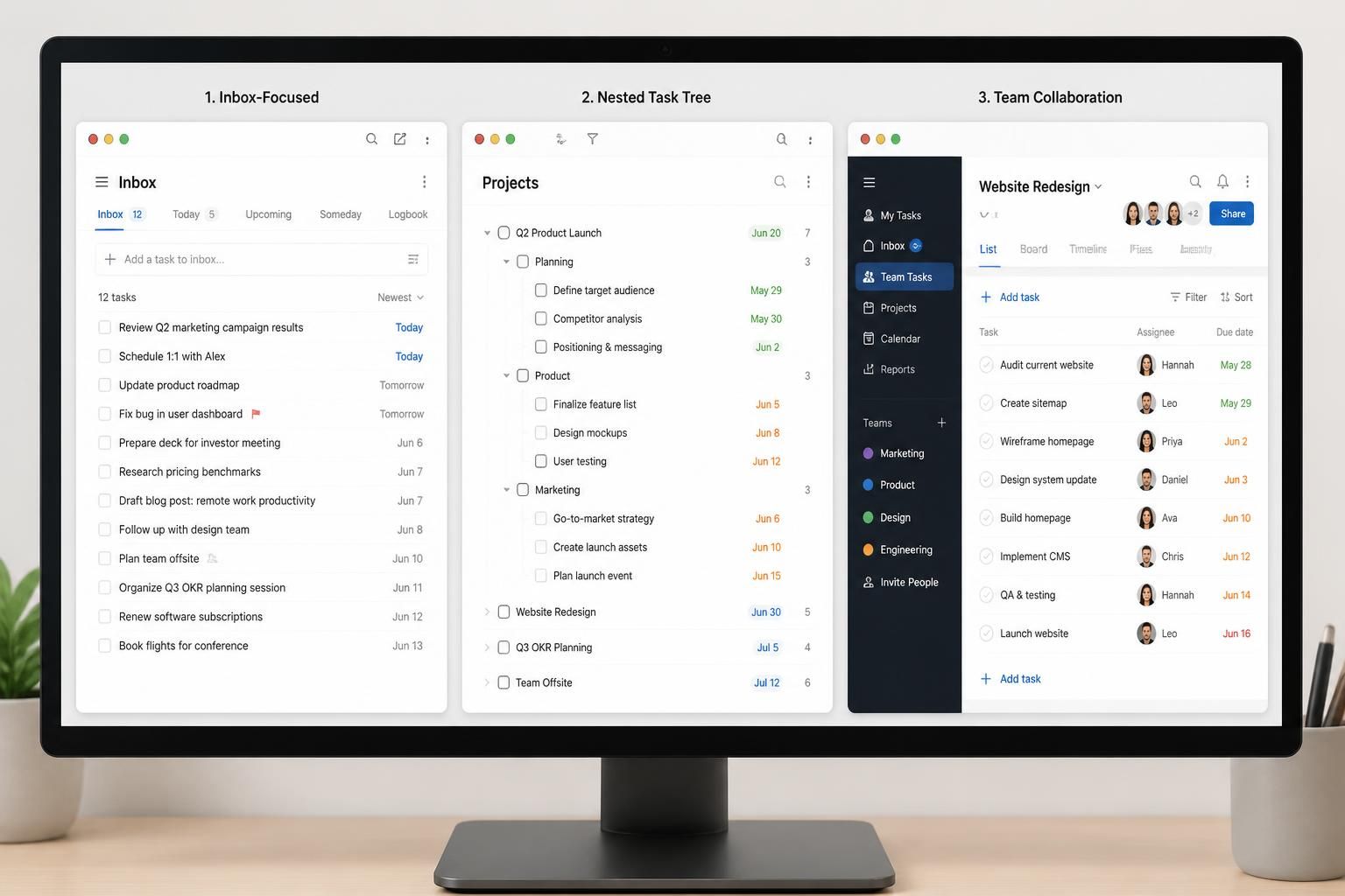
Apps influenced by Getting Things Done often highlight an inbox on desktop. TickTick and OmniFocus commonly present a left navigation rail, a central list, and a detail pane. That layout suggests quick intake, then later processing. However, screenshots also reveal whether “processing” stays lightweight or becomes a project.
For example, TickTick’s typical desktop view makes it easy to add a due date, tags, and priorities. As a result, the list can become structured quickly. Yet a screenshot from a free-tier account often shows locked controls or missing advanced views. That visual cue matters because it predicts whether a team will hit limits mid-rollout.
OmniFocus screenshots often show richer metadata and custom “perspectives.” Consequently, power users can slice work by context or energy level. On the other hand, the density can intimidate new staff. If Northline hires a coordinator who needs simple daily checklists, a complex screen may slow adoption.
Plan-first interfaces: projects and timelines as the default
Some desktop interfaces assume you already know the project structure. Quire is a strong example because its screenshots often show a tree of parent and child tasks. That visual hierarchy mirrors how teams break work down. Moreover, it helps people see dependencies without opening extra dialogs.
In Northline’s case, “Client Onboarding” becomes a parent task with nested subtasks for contract, kickoff, data intake, and first invoice. A screenshot of that tree reveals whether the hierarchy feels readable or cramped. If indentation and spacing stay clear, users will trust the structure. If not, they will flatten tasks and lose meaning.
Meanwhile, timeline or Gantt-style views emphasize schedules. Quire’s timeline can map workload, which helps an operations manager spot overload. Therefore, a single screenshot of the timeline can reveal whether the tool supports real resource thinking or just dates on a list.
Collaborate-first interfaces: people and permissions appear early
Team-oriented desktop software shows assignees, comments, and activity near the task list. ProofHub and nTask often highlight collaboration elements, such as progress visibility and task comments. Consequently, screenshots from these tools can show whether communication stays attached to work or drifts into separate channels.
Yet collaboration also creates noise. A busy activity feed can crowd out the next action. Therefore, Northline should look for screenshots that show filters, mute options, or “assigned to me” focus. The best user experience keeps teamwork visible without making the list feel like social media.
With that interaction model in mind, the next step is to evaluate what screenshots reveal about hierarchy and planning depth.
Task Hierarchy and Visual Density: What Desktop Screenshots Reveal About Complexity
As task lists grow, interface choices become operational risks. A desktop to-do list can feel like a calm dashboard or a chaotic spreadsheet. Screenshots make those differences measurable because you can count visible rows, scan label clarity, and notice whether key fields hide behind clicks. Therefore, hierarchy and density deserve a dedicated comparison.
Flat lists vs. nested structures: choosing a mental model
A flat list works well for errands and short cycles. Microsoft To Do and Google Keep often display simple lists that reduce decision fatigue. However, screenshots also reveal the ceiling. When a project needs subtasks, a flat layout forces workarounds like prefixes, emojis, or duplicated lists.
Northline experiences this during an audit cycle. A flat list leads to items like “Audit: collect docs,” “Audit: review logs,” and “Audit: close findings.” That looks fine in a screenshot until five audits run at once. Then the list becomes a wall of similar text. Consequently, staff mis-click or skip steps.
By contrast, Quire’s infinite nesting allows “Audit Q3” to contain every step. That screenshot displays context at a glance. Moreover, the parent-child relationship reduces duplication and clarifies what “done” means. The trade-off is navigation, because deep nesting can create hidden work. Therefore, the best interfaces show breadcrumbs, collapsible nodes, and quick search.
Checklists inside tasks: a subtle but powerful middle ground
Some software, such as Things and Todoist, often uses checklists or subtasks without deep trees. Screenshots from these tools usually show a clean project list on the left and a focused task panel on the right. As a result, you can keep the surface simple while still storing steps inside each item.
This design helps when Northline tracks recurring processes like monthly billing. A single task called “Run billing” can hold a checklist: export time logs, verify discounts, send invoices, and log confirmations. Therefore, the interface stays uncluttered, yet the work remains standardized.
However, screenshots also reveal whether the checklist hides behind a click. If staff must open each task to see steps, they may skip them under pressure. Consequently, a good desktop user experience offers quick expand/collapse or inline checklist previews.
Information density: readability, scanning, and error rates
Dense interfaces can improve speed for experts. Workflowy, for instance, often looks like an outline on a notepad. That screenshot can feel lightweight and fast, especially for people who think in bullet points. Moreover, the “zoom into a node” interaction can reduce overwhelm.
Nevertheless, minimal design can also conceal missing features. Workflowy screenshots often show limited visual encoding for priority or due dates. If color and labels stay sparse, time-sensitive work becomes harder to scan. Therefore, teams should test whether urgency signals appear without opening each item.
At the other extreme, Evernote and Notion screenshots often show rich content blocks, tables, and embedded media. That works well for knowledge-heavy tasks. Yet it can slow quick capture. Consequently, Northline might use those tools for SOPs and meeting notes, while using a leaner to-do view for daily execution.
Once hierarchy and density are understood, it becomes easier to compare features that influence day-to-day usability, such as scheduling and reminders.
Scheduling, Reminders, and Daily Planning: Desktop Screenshots as Usability Evidence
Deadlines do not fail because people forget that time exists. They fail because the interface does not surface time at the right moment. Screenshots can show whether scheduling tools live in the main flow or hide in submenus. Therefore, a comparison of calendar cues and reminder controls offers practical value.
Due dates, start dates, and recurring tasks: clarity beats flexibility
Todoist screenshots usually show quick date entry and priority flags. That supports fast planning for individuals and small groups. Moreover, integrations with tools like Gmail and Slack often matter because tasks start in messages. As a result, the desktop experience can reduce copy-paste labor.
However, some screenshots show weaker calendar visualization. If a tool forces you to rely on filters rather than a true time view, planning can feel abstract. Consequently, users may overbook a day because the list does not show capacity.
Quire and nTask screenshots may show timelines or Gantt-style planning. That visual makes scheduling tangible. Therefore, a manager can see that three onboarding tasks overlap with a billing run. The key usability test is simple: can a date be adjusted with drag-and-drop, or does it require opening a modal window?
Reminder design: helpful prompts vs. alert fatigue
Remember the Milk is known for robust reminder options across devices. A desktop screenshot often reveals how reminders attach to tasks and how “smart lists” surface them. Moreover, natural language entry can speed capture, which helps people who think in sentences.
Yet reminders can become noise, especially in team settings. ProofHub users often report that notifications can feel overwhelming if settings are not tuned. Therefore, screenshots of notification preferences matter. A good interface makes it easy to limit alerts to assignments, mentions, or due-date changes.
Daily planning views: suggested tasks, focus modes, and pacing
Microsoft To Do frequently highlights a “My Day” style planner with suggested tasks. That screenshot can feel supportive for people who need a daily reset. Additionally, Outlook integration helps if work already lives in Microsoft 365. Consequently, the desktop experience can reduce context switching.
Still, the simplicity has costs. Screenshots and real use often reveal limited subtasks and limited team collaboration. If Northline needs handoffs with accountability, a personal planner screen will not carry the process. Therefore, the interface must match the job, not the mood.
TickTick adds tools like a Pomodoro timer and time tracking in some setups. A screenshot with a focus timer can signal a work style that values pacing. On the other hand, teams may prefer fewer built-in widgets and more shared clarity. Thus, the best choice depends on whether focus support or collaboration support drives outcomes.
With scheduling understood, the next lens is cross-platform coverage and how desktop and mobile experiences stay consistent.
For additional walkthroughs of popular layouts, video demos can help you connect screenshots to real clicks and keyboard flow.
Watching a second tool in action helps you compare how nested tasks, boards, and timelines behave beyond static screenshots.
Cross-Platform Consistency and Desktop-First Workflows: What Interfaces Tell You
A desktop to-do list often anchors serious work because it supports larger views, multiple windows, and keyboard shortcuts. However, modern teams also capture tasks on phones. Therefore, a useful comparison must include cross-platform alignment, not just desktop polish.
Cross-platform coverage: the checklist that screenshots cannot fully prove
Some tools run nearly everywhere. Wunderlist historically appeared across iOS, Android, Windows, macOS, and web, and it set expectations for simple shared lists. Microsoft To Do later absorbed much of that spirit, especially for Microsoft ecosystems. Meanwhile, Google Keep works well across devices for quick notes and lightweight reminders.
Yet screenshots can hint at platform maturity. If a desktop screenshot shows a narrow feature set, it may reflect a “mobile-first” product that treats desktop as a wrapper. Conversely, a detailed desktop app with robust menus can signal a desktop-first philosophy. Therefore, teams should check whether core flows look equally intentional on each platform.
Keyboard shortcuts and speed: small interface cues with big impact
Desktop usability often depends on how little the mouse gets used. Quire emphasizes smart keyboard shortcuts, which can be visible in menu hints or tooltip screenshots. Moreover, outline tools like Workflowy reward fast typing and quick indent/outdent commands. As a result, experienced users can move faster than with click-heavy apps.
Nonetheless, speed should not reduce clarity. If shortcuts exist but the interface hides discoverability, new users struggle. Therefore, Northline should look for in-app shortcut overlays and consistent command patterns. The best user experience lets novices click while experts fly.
Offline access and reliability: operational confidence signals
Notion offers broad workspace flexibility and can replace several tools, from notes to Kanban boards and calendars. However, teams should watch for offline behavior, since access patterns vary. Screenshots of offline modes or sync indicators can reveal how the software communicates reliability.
Remember the Milk offers offline use in paid tiers in many setups. That matters for travel or unstable Wi-Fi. Consequently, a tool’s pricing page and desktop settings screen matter as much as the task list view. The interface should make sync state obvious so users know whether updates are safe.
Desktop to mobile handoff: capture anywhere, review on desktop
Google Keep shines for voice capture and quick OCR-like retrieval of text in images. That mobile strength can feed a desktop planning session later. Nevertheless, Keep lacks robust due dates and recurring schedules in many workflows. Therefore, it often works best as a capture pad, not a full task management system.
For Northline, a pragmatic approach emerges: capture on mobile, clarify on desktop, and coordinate in a shared workspace. The interface comparison supports that hybrid strategy, because screenshots reveal which tools respect each phase. The next step is to formalize an evaluation method and summarize the strongest fits by usage scenario.
Desktop To-Do List Software Comparison: Evaluation Criteria, Table, and Fit-by-Scenario
A fair comparison requires consistent tests. Otherwise, screenshots become cherry-picked. The most reliable approach evaluates each to-do list app against the same criteria, using real logins and real tasks. Moreover, cross-checking impressions with independent reviews on G2 and Capterra helps reduce bias.
Evaluation criteria that connect screenshots to outcomes
First, check whether a usable free tier exists, not just a short trial. A screenshot of a paywall prompt can end a rollout. Second, map the best-fit user: solo, small team (2–10), or larger group. The interface often signals this through assignee controls and permission settings.
Third, test task hierarchy. Screenshots quickly show whether the tool supports subtasks, nested lists, or only flat items. Fourth, confirm cross-platform coverage across iOS, Android, web, Windows, and macOS. Finally, compare independent ratings to ensure the user experience holds up beyond one environment.
Side-by-side desktop interface comparison table
| Software | Desktop interface “tell” in screenshots | Hierarchy depth | Best fit | Free tier signal |
|---|---|---|---|---|
| Quire | Tree-structured tasks plus optional Kanban and timeline | Very deep nesting | Small teams needing structured breakdowns | Starts at $0/month |
| Todoist | Minimal list with priorities, fast date entry, filters | Subtasks/checklists | Solo or small team with integrations | Strong free version; paid adds depth |
| Microsoft To Do | Daily planner emphasis and simple lists | Limited | Personal planning in Microsoft ecosystems | Free |
| TickTick | Three-pane layout with priorities and focus tools | Moderate | Individuals who want GTD-style flow | Free tier feels constrained |
| Notion | Workspace blocks, databases, and multiple views per page | Flexible via databases | Teams combining docs and tasks | Free version has limits |
| Google Keep | Sticky-note grid; fast capture and reminders | Very limited | Personal capture and lightweight lists | Free |
| ProofHub | Project-centric screens with comments and progress cues | Subtasks supported | Teams wanting predictable cost structure | Paid-first product |
Fit-by-scenario: matching user experience to real work
If the goal is to reduce mental clutter with minimal friction, Microsoft To Do and Google Keep often win on simplicity. However, they can under-serve complex projects. If the goal is structured execution with visible breakdown, Quire’s nested tasks and reporting views align well.
For people who live in email and chat, Todoist’s integration story can matter more than its visuals. Meanwhile, Notion works best when tasks and documentation must live together, such as SOP-heavy operations teams. Finally, ProofHub and nTask can suit teams that prioritize collaboration structure over personal planning polish.
When choosing, a helpful question is: what will the “messy Monday morning screenshot” look like after a month? The right tool makes that screen readable and actionable, even under pressure.
What should be examined first in desktop to-do list screenshots?
Start with the default view and navigation. A screenshot will show whether the software pushes an inbox, a project list, a board, or a calendar first. That first screen predicts whether the user experience favors quick capture, structured planning, or collaboration.
Which interface feature most improves task management for complex projects?
Clear hierarchy usually helps the most. Nested tasks or well-designed subtasks let you break large work into steps while keeping context. In screenshots, look for readable indentation, easy collapse/expand controls, and fast ways to add details without opening multiple dialogs.
How can usability be tested without committing to a paid plan?
Use a real workload in the free tier when available. Create at least three projects, add recurring tasks, assign priorities, and test search. Also check whether key controls show paywalls in the interface, since that often appears immediately in desktop screens.
Do cross-platform apps always deliver the same desktop user experience?
Not necessarily. Many tools cover iOS, Android, web, Windows, and macOS, yet the desktop version may be a thinner wrapper. Screenshots can hint at this through limited menus or missing views. Therefore, verify that the core workflow feels complete on desktop, not just accessible.

With over 30 years of experience, I specialize in streamlining operations and enhancing productivity. As an Operations Consultant and Editor at EfficientToDoList.com, I am passionate about helping individuals and organizations manage their tasks more effectively.